

The wait is finally over! We are thrilled to unveil our latest feature – Marty’s Sensor Dashboard – bringing a whole new dimension to your Marty coding experience. In this blog post, we will delve into the reasons behind this exciting feature, outline the benefits it brings to the classroom, and provide a step-by-step guide on how to make the most of it. So, let’s dive in!
What is Marty’s Sensor Dashboard?
The recently launched sensor dashboard is a graphical tool designed to enable users to visualize and interact with data collected from sensors. It provides a user-friendly way for students to monitor and analyze sensor readings in real-time, enabling them to make data-driven decisions and gain insights from the collected data.
Why we introduced the Sensor Dashboard:
Marty’s sensor dashboard was introduced to increase the possibilities for students looking to work with sensor data. By providing an intuitive visual interface, it empowers users to monitor, analyze, and make informed decisions based on the information collected by sensors.
5 Benefits of the Sensor Dashboard:
- Data Visualization: The dashboard provides a graphical representation of the sensor data, allowing users to visualize patterns, trends, and anomalies more easily. They can observe the changing values over time, identify correlations, and uncover insights. Recognizing these patterns allows students to make informed decisions on how to optimize their code, resulting in more streamlined and efficient solutions.
- Experiential Learning and Exploration: Interacting with a Sensor Dashboard allows students to actively explore and experiment with sensor data. They can adjust settings, manipulate variables, and observe the resulting changes in real time. This experiential learning approach encourages curiosity, critical thinking, and hypothesis testing, promoting a deeper engagement with coding concepts.
- Cross-Curricular Integration: The use of a Sensor Dashboard bridges coding lessons with other disciplines, such as mathematics. Students can collect data from sensors, analyze it using coding concepts, and draw connections between disciplines. This integration shows students how coding is applied in real-world contexts and encourages interdisciplinary thinking.
- Identifying Errors and Debugging: Analyzing coding data allows learners to identify errors in their code. By carefully examining the data, learners can pinpoint where the code is not functioning as expected, enabling them to debug and fix issues more effectively.
- Tracking Progress and Learning: The sensor dashboard allows learners to track their progress over time. By reviewing their previous code, they can identify areas of improvement, and measure their coding proficiency. This analysis helps in setting goals, monitoring achievements, and understanding the learning curve, providing a clear roadmap for continued development.
How to Get Started with the Sensor Dashboard:
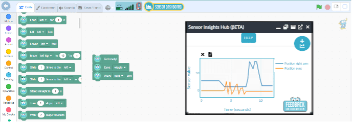
Getting started is a breeze. Simply select the Sensor Dashboard option within MartyBlocks, and a new window will open, ready to unleash a world of data-driven possibilities. The best part? You have complete control over the position and size of the window, ensuring it seamlessly aligns with your coding project.
![]()
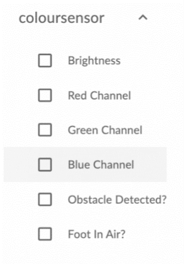
Once you’ve connected to your Marty, you’ll be greeted with an empty graph on the screen. To the left, you will discover a list of sensors and once expanded, individual input streams. For example, the color sensor presents Red, Green, Blue, and Clear input streams, each providing unique data.
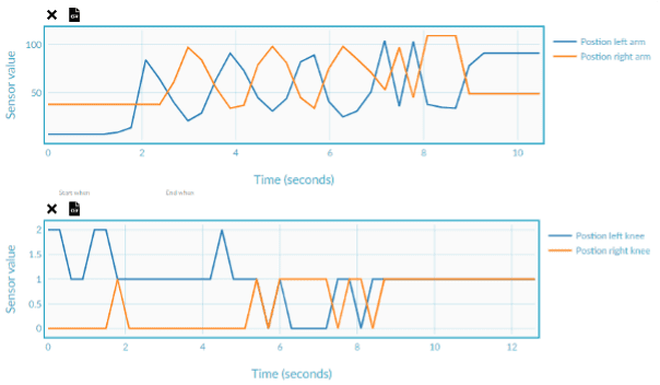
Ready to collect data? Simply select at least one input stream and hit the Play button located at the bottom left of the graph. Watch in real-time as the data gracefully plots onto the graph, giving you a dynamic visual representation of the sensor readings streaming from Marty.
And if you need additional graphs, just click the button in the top right corner to generate a new customizable graph to configure with input streams from any available sensors.
Need to export your data for further analysis? No problem. Just click the ‘Export CSV’ link on the top left side of the plot, and your data will be saved in a convenient .csv format. This allows students to save historical data for later analysis and comparison.
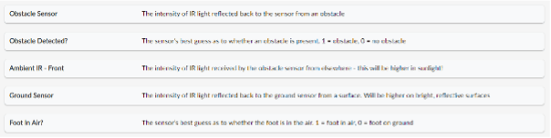
But wait, there’s more! We’ve got your back with a comprehensive help guide and a handy list of terminology. So, if you come across any unfamiliar terms while using the Sensor Dashboard, don’t worry. We’ve included brief definitions right within the feature, making it easy for you to navigate and understand the sensors and their properties.
For further information, check out our Marty’s Sensor Dashboard User Guide!
The Sensor Dashboard in MartyBlocks is here to revolutionize students’ coding journey. Get hands-on with real-time sensor data, gain a deeper understanding of data analysis, and experience the engagement and excitement that comes with exploring coding through the Marty the Robot app. Happy coding!

Other posts you may like
How to Teach Your Kids to Code
Perhaps your kids have already tried a micro:bit in class or started coding with Scratch in an after-school club. If they are showing an interest in coding, continuing that learning...
Why is AI Literacy Important?
As we mark AI Literacy Day, it is worth asking a crucial question: why does AI literacy matter so much for today’s students? It's a fundamental part of the digital...
Why Probeware Matters in Science Education
In today’s classrooms, hands-on learning is essential. Students learn best when they can see, measure, test, and experience concepts directly. That’s where probeware comes in. By giving learners the tools...
TRY MARTY
FOR FREE
Are you looking for new STEM resources for your classroom? Robotical are loaning Marty the Robot to schools for no-obligation, 2 week trials.